
Conciergo
Art Direction | Graphic Design | Brand System Management | Retouching | UX Design
Social Media Marketing | Email Design | Merchandise | Copywriting
Art Direction
& Design Systems
As Art Director and Graphic Designer for Conciergo, I helped shape and expand the brand across digital and print touchpoints. Working from the existing identity, I developed a flexible visual system that created consistency across the app experience, website, email campaigns, social media, and hotel leave-behind materials. My role focused on bringing the brand to life in ways that felt polished, useful, and visually cohesive across every channel.


Regional adaptation
& guest experience
I adapted the design system for different hotel partners, regions, and guest demographics while maintaining a consistent brand experience. The work focused on clarity, accessibility, and creating a welcoming experience for travelers. The brand has evolved since my time on the project; the work shown here reflects my contributions during that phase.


agency work:
healthcare & Pharmaceutical
Graphic Design | Retouching | Presentation Design | Social Media & Email Design
brand systems & Marketing Design
At a creative agency, I supported Abbott Laboratories and other healthcare and pharmaceutical brands through a range of visual design work across digital and print. This included social media, email campaigns, presentations, branded collateral, and image retouching—always with a focus on keeping each piece clear, cohesive, and aligned with the larger brand system.

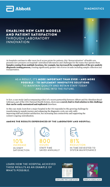
Visual Content & Brand Consistency
My role centered on creating polished visual assets that could flex across teams and channels while staying consistent with established brand guidelines. From presentation design and campaign graphics to photo retouching and digital content, the work balanced clarity, accessibility, and thoughtful design across healthcare-focused communications.


visions espresso
Graphic & Packaging Design | Branding | Photography | Retouching | Illustrations
Social Media Marketing | Email Design | Merchandise | Copywriting

Brand &
Packaging Design
At Visions Espresso, I helped evolve and support the brand across packaging and product materials for a wholesale café and homewares audience. I worked within the existing identity to create cohesive, thoughtful packaging systems that felt clean, consistent, and aligned with the brand’s craft-focused personality.
icon design
I created icon sets to help clarify product categories and support the brand’s visual language across print and digital. The system was designed to make information easier to navigate while keeping things simple, clear, and visually consistent.


Packaging &
Merch design
I designed a mix of promotional materials across social media, email, print, and merch. This also included photography selection and retouching, illustration, and light copywriting support—helping keep the brand feeling consistent and connected across different customer touchpoints.


sowgoods
Graphic Design | Branding | Website Design | Infographics | Illustrations
SEO | Merchandise | Copywriting | UI/UX

good deeds inspired
by data & design
Sowgoods is an educational nonprofit concept focused on using data and design to create engaging, accessible infographics that inspire awareness and action. The goal was to translate complex environmental and social topics into clear, shareable content for social media, web, and classroom use—helping people better understand the impact of everyday choices.


icon design
I developed a flexible icon system that could adapt across key topics like biodiversity, agriculture, politics, and energy. Each icon was designed to act as a simple visual shorthand, building a cohesive language that could communicate across a wide range of subjects while staying consistent and easy to understand.


merch &
Applied Design
I extended the visual system into simple merchandise and applied design concepts, exploring how the identity could live beyond digital spaces. This included translating the graphics into wearable and physical formats that reinforced the educational message in a more tangible, everyday way.
Color Palate
The color palette was inspired by natural elements—sunlight, water, and earth—representing energy, sustenance, and life. The system was designed to feel grounded and approachable while supporting clarity and emotional connection across educational content.
